Methods
Built-up changes
"Built-up" area includes land covered by houses, buildings, or other fabricated structures, and is, therefore, a useful indicator of urbanization. In order to determine the changes in the built-up area from 2000 to 2017 in Ethiopia, each Landsat pixel across the entire country needed to be assigned a value of "built-up" (1) or "not built-up" (0). Several key challenges associated with accurately predicting built-up areas in Ethiopia were identified:
- It is a large country (1.1 million km2) with highly variable landcover type and terrain;
- Buildings are small and do not generally fill an entire 30m x 30m Landsat pixel. The majority of built-up pixels are, therefore 'mixed', containing, e.g., both a building and bare soil; and
- Most roads are not paved and are therefore similar in appearance to bare soils.
To generate yearly built-up "masks" in which each pixel is assigned a value of 1 (built-up) or 0 (not built-up), we developed an analysis pipeline comprising multiple machine learning approaches. The workflow, described in detail below, included an unsupervised learning (K-means clustering) pre-processing step to narrow the search space for built-up pixels, followed by a supervised learning step in which the candidate pixels identified in the unsupervised learning step were predicted using a binary Random Forest classifier.
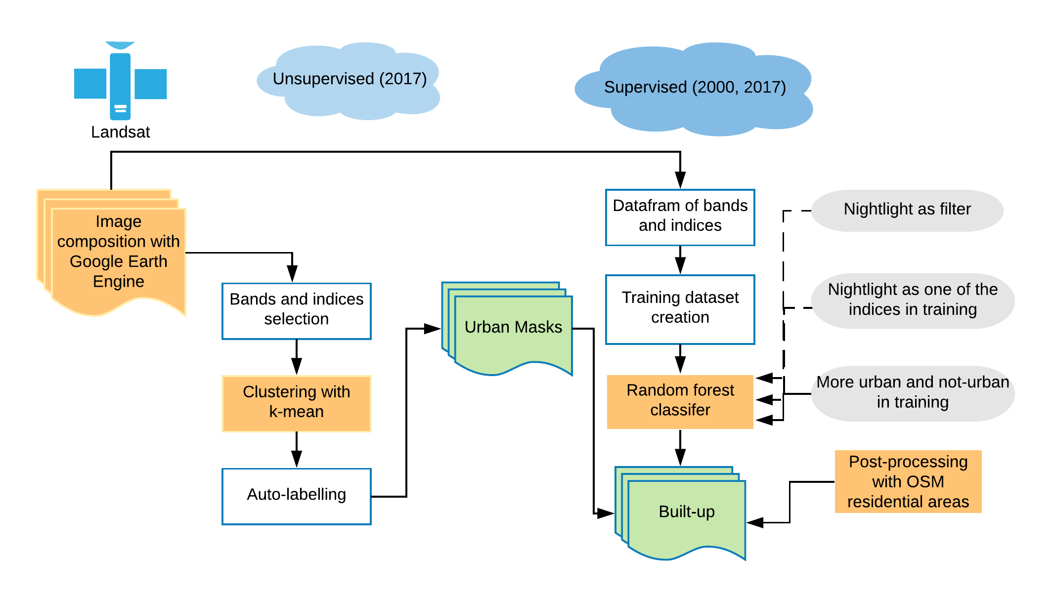
The following sections provide additional detail on our analytics pipeline and the specific methods used:
- Landsat composition using Google Earth Engine
- Creating masks with candidate built-up pixels using K-means clustering
- Supervised classification within the built-up masks
- Post processing
Landsat composite generation with Google Earth Engine
A single Landsat scene does not cover the entirety of Ethiopia; the entire country comprises 50 scenes, not all of which were captured on the same day. Further, on any given day, clouds may obscure part or all of a given scene. It is, therefore, necessary to incorporate images from multiple time periods to cover the entire country.
For the classification process, we believed the incorporation of a time series images would improve our prediction accuracy, as those landcover classes that change in appearance throughout the year, e.g. grasslands or agricultural areas, could more easily be distinguished. We used Google Earth Engine to create a series of composite images to be used for fitting the machine learning models described above. For 2000 and 2017, we created three-composite images of average quarterly pixel values for each of the 50 Landsat scenes covering Ethiopia. Due to data quality issues, cloud-free composites for all scenes were built for quarters 1, 2, and 4 only. By creating multiple cloud-free composites, each covering a 3 month period, we were able to fit models with features (predictor variables) representing band reflectance values from multiple periods throughout the year. Initial tests using features from a single time period only, e.g. Q3, did not capture the dynamic nature of many landcover classes as indicated by test-set prediction accuracy. Each quarterly composite contained 6 spectral bands from Landsat: red, green, blue, near infrared (NIR), and 2 short-wave infrared (SWIR) bands.
Below is an example of creating a quarterly composite in Google Earth Engine using Javascript.
var collection = ee.ImageCollection('LANDSAT/LC08/C01/T1').filterDate('2017-04-01', '2017-06-30');

// Create a cloud-free composite with custom parameters for
// cloud score threshold and percentile.

var customComposite = ee.Algorithms.Landsat.simpleComposite({
  collection: collection,
  percentile: 50,
  cloudScoreRange: 0
});
The code above returns a Landsat-8 mosaic covering Ethiopia in the second quarter of 2017. Shown below is the true-color image (using the red, green, and blue bands). The inclusion of all 6 bands allows the generation of various 'indices', or derived products that combine information from multiple bands to emphasize certain spectral qualities, such as enhancing soil, vegetation, or built-up areas. An example of a commonly used index is the Normalized Difference Vegetation Index (NDVI) which combines information from the red an NIR bands of an image.
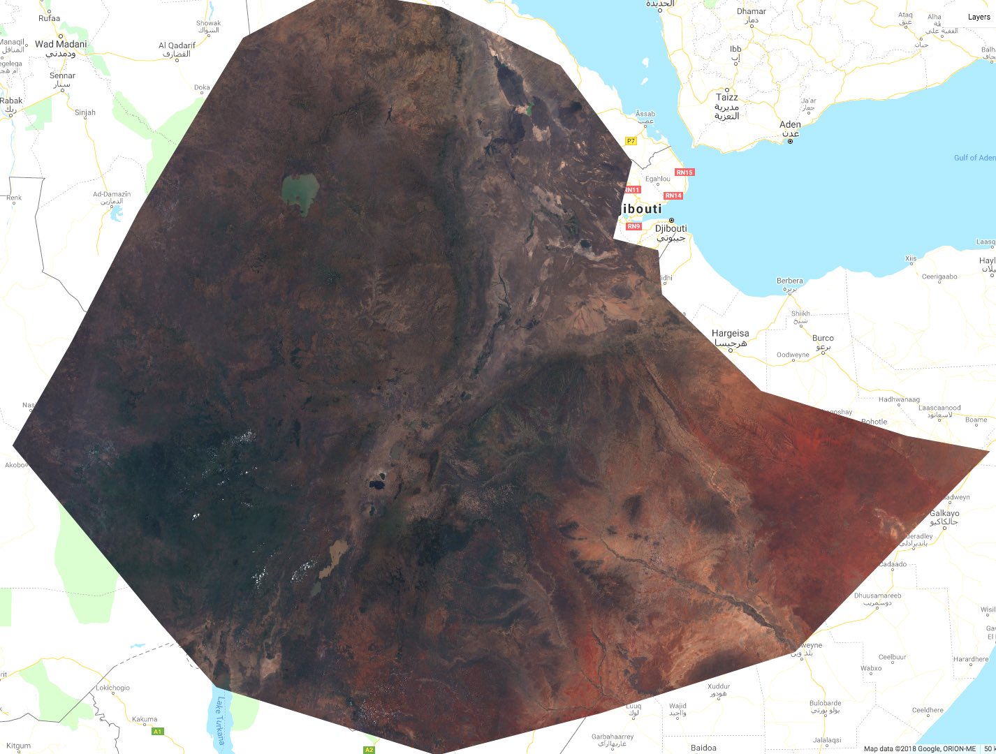
Composites were made for 2017 using Landsat-8 and for 2000 using Landsat-7. As noted above, we generated composites for quarters 1, 2, and 4 only. The 3rd quarter (July-September) is the rainy season and did not contain a sufficient number of cloud-free scenes to generate high-quality composites.
Creating built-up masks with unsupervised machine learning
Unsupervised clustering works well to identify distinct spectral classes from imagery. However, it is not to adequate by itself to classify built-up area, as there is considerable confusion between built-up areas and bare earth. It can, however, be useful to mask out areas that are definitely not built-up. By clustering the data into many smaller classes, then automatically selecting which classes cover built-up areas, a mask can be generated to use along with the supervised classifier. For clustering, a K-means algorithm was used from the scikit-learn library. K-means requires specifying the total number of classes in advance, it then clusters the image pixels into that many classes so that each class is as spectrally distinct as possible.
Input bands
The input bands selected as input features for K-means clustering have a significant impact on the model output. We, therefore, tested multiple combinations of input bands were prior to selecting a final unsupervised model. Using the original bands (Blue, Green, Red, NIR, and 2 SWIR bands) did not work well due to a lack of atmospheric correction of the input data. This can cause problems with any algorithm that uses the raw absolute values of the input images since the (uncorrected) atmosphere can vary from scene to scene and date to date. Band indices are generated using 2 or more input bands and because they typically use band differences and ratios, they are less sensitive to changes in the atmosphere. After some experimentation the following products were used as the input bands to the K-means model:
- NDVI: Normalized Difference Vegetation Index (uses red and NIR bands)
- BSI: Soil Index (uses red, nir, blue and a swir band)
- NDBI: Normalized Difference Built-up index (uses NIR and a swir band)
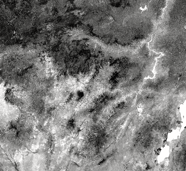
- NDWI: Normalized Difference Water Index (uses green and NIR bands)
Reducing the 6 bands to 4 also improved the computation time. In the NDWI example below, water is clearly white, however built-up areas are also bright and clearly stand out compared to the background.
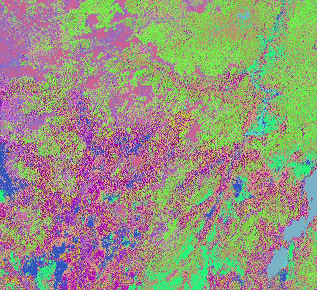
Clustering
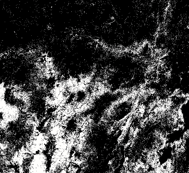
The k-means algorithm was tested using a range for the total number of classes, from 5 to 50. The more classes, the longer the algorithm takes, and it was found that anything above 15 classes didn't provide any further distinction of built-up areas. Even with just 15 classes, the output class map is hard to visually decipher. As can be seen below, although the city clearly stands out, the region is made up of several classes, and those classes can be seen in other parts of the scene that are not built-up areas.
Auto-labeling
Unsupervised classifiers don't use training data and don't output what the specific class labels are, just that they are distinct from each other. A final output map can be manually labeled by a user viewing it along with the original imagery, but it is a time-consuming process involving the examination of each class and multiple parts of the image. As the number of classes gets higher this gets increasingly difficult.
Instead, to automatically label the classes we use a small amount of training data for built-up areas. A histogram of the classes is generated from all the pixels underneath the built-up training polygons. The most populous classes in the histogram are selected until we've selected enough classes to cover some threshold percentage of pixels in the training areas. For instance, with a threshold of 85 we select the most common classes in the training area until 85% of the region is labeled. The final output image is a binary image of 1's where it's possibly urban, and 0 everywhere else.
While the clustering algorithm does identify built-up areas, it also includes a significant amount of other areas. Still, this is an initial cut at the mask, so what is needed is a mask that includes all the built-up areas, even if it includes a lot of false positives. We, therefore, used the results as an input to a supervised classification step, described below, to help clean the final predictions.
Supervised classification within urban masks
Following the application of the masks derived from the unsupervised learning procedure described above, areas were left that contained urban area pixels and some pixels that were difficult to distinguish, e.g. bare soils and dry grassland areas. In order to predict the location of the built-up pixels within the search region resulting from the unsupervised step, a binary classifier was used within the masked area to predict 1) built-up and 2) not built-up. Samples to train the model were taken from 4 Landsat tiles representing a large geographic distribution over Ethiopia.
Training data
A supervised model is only as good as the training data that is used to train it. Development Seed's Data Team, a group of eight expert mappers, mapped large urban areas in the composited Landsat8 imagery of 2017 using JOSM. In total, the team mapped more than 200 scattered built-up areas over lowland Ethiopia. The initial Random Forest classifier was trained with a dataset created from only four image tiles (out of 24 tiles) and contained about 5x the number of non-built-up pixels than built-up pixels.
After some initial tests, more built-up pixels were added to the training data in order to balance the datasets and to capture more of the variation within built-up areas. The addition of the training data greatly improved the effectiveness of the classifier.
Random Forest Classifier
To select a final model, several machine learning algorithms were tested including Random Forest, a Gradient Boosted Decision Tree (using the XGBoost package for Python), and a Support Vector Machine. Based on various metrics including accuracy, F1 score, and runtime for fitting the model and predicting landcover over full Landsat scenes, the Random Forest classifier was selected as a final model.
The feature set (predictor variables) for each Landsat pixel included the same index bands used in the unsupervised learning step; NDVI, BSI, NDBI, and NDWI. For each pixel, the 4 indices were generated for each of the three quarterly mosaics. Therefore, each pixel was assigned 12 (4 indices X 3 time-steps) features. NDVI and, NDWI, and NDBI had a higher predictive value than the BSI bands, as can be seen in the importance diagram below.
The variable that was most important in classification was 'ndvi.1'" - this is the NDVI value for the 2nd quarter ('ndvi' is quarter 1, and 'ndvi.2' is quarter 3). Overall what this plot illustrates is that most of the information comes from a single date and the importance drops off with each date added. Having two dates adds considerable information, adding a third slightly less. This makes intuitive sense, as we add more dates the marginal quantity of information added decreases.
We also tested the impact of prediction probability cutoff for the "built-up" class as a function of F1 score, as shown below.

Based on these results, we determined that the default probability of >50% for predicting the built-up class was suitable. In general, Random Forest classifiers have relatively few hyper-parameters to tune in order to select the best performing model. The impact of the number of decision trees in the model on the F1 score was tested and it was found that the F1 score did not improve beyond 100 trees. The final model, therefore, included a prediction cutoff for the urban class of 50% and 100 trees. The resulting "out-of-bag" (OOB) prediction accuracy of the final model was approximately 95% and an F1 score of 0.998.
Despite the high OOB accuracy and the F1 score of the model, there were locations in which the model did not generalize well. In particular, the model had a difficult time distinguishing certain bare soils from urban areas. This is partially done to the fact that Landsat pixels are fairly large (900 square meters) and may contain small urban areas and large bare soil areas in the same pixel. The reflectance of certain urban areas and bare soils can also be very similar, depending on, e.g. materials used for building construction. It's very important to remember that high test set accuracy and F1 scores do not always translate to a model that generalizes well across large geographic areas.
In order to improve the built-up classification results, we tested several other methodologies (detailed below), but none worked as well as adding and improving the training dataset. The image below shows prediction results of the final supervised model for a selected region in Ethiopia.

Post-processing
As a final post-processing step, we applied a mask layer generated from labeled OSM residential areas to the 2017 built-up predictions, assigning any pixels outside of the areas labeled "urban" a value of 0. The OSM residential layer is fairly course, with boundaries that generally were overly generous and included non-residential areas. Our predictions, therefore, represent a more detailed, granular, and accurate map of built-up areas than is currently available from OSM or other sources.
Incorporating nightlight
Both DMSP and VIIRS are good approximate indicators of population settlements and road networks because populated areas are illuminated at night. Therefore, nightlight of DMSP (2000) and VIIRS (2017) were used to filter the built-up classification results as a post-processing step. We also attempted to use the nightlights data as another 'band' in the input data for the Random Forest Classifier (in addition to the indices for the 3 quarters).
Neither of these approaches in leveraging the nightlights data proved to be useful and did not improve model performance. This was likely due to the following reasons:
- Built-up areas may not be illuminated at the time at which the image was captured. Local collection time for DMSP and VIIRS are 7:30 pm and 1:30 am, respectively.
- The pixels are not well aligned between nightlight and built-up classification result.
- Resolution of DMSP and VIIRS are 1km and 750m respectively, a substantial coarser resolution than the Landsat bands (30 m).
- Nightlight data for 2017 was composited from the VIIRS day-night band, but nightlight in 2000 was derived from DMSP. DMSP is known to have over-saturation problems in urban areas.